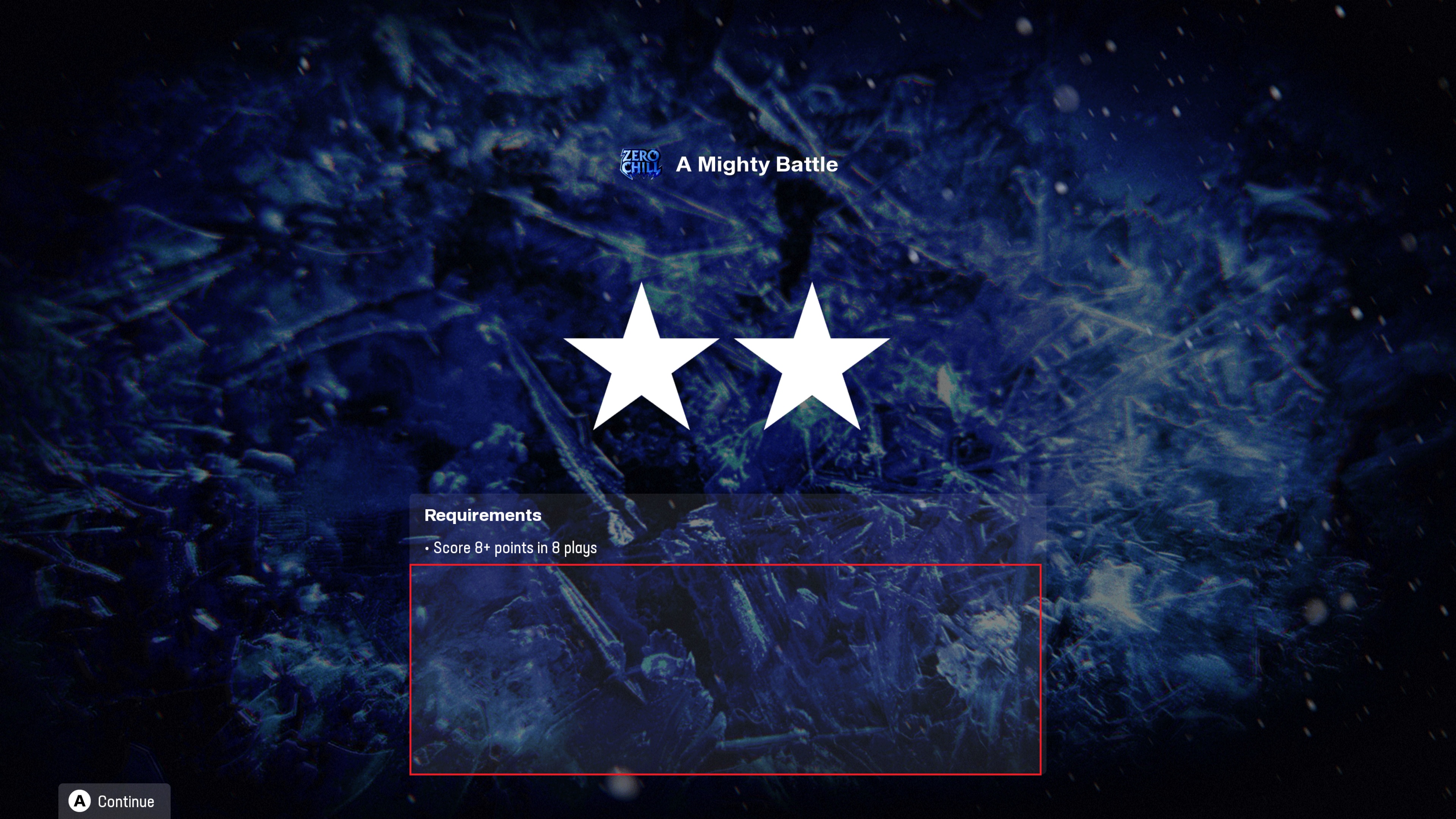
Is anyone having an issue with the font layout for challenges? Everything else looks normal but the fonts seem out of wack and the detailed requirements in between challenges are cut off along with the stars. I noticed this a few weeks ago out of the blue, just wondering if anyone else is experiencing it. Thanks!
same here. because of that it is not longer possible to see the bonus goal(s) when you pause a challenge.

It came out with the latest release maybe last week. I have no idea why they changed the layout but it's SO bad.
As someone who does front end development for a living, this never should have even made it past initial developer testing.
The fact that the "max stars" component renders at the end of challenges, the bonus section doesn't display, there's clearly a width cap that the stars and descriptions span past and get cut off.
It's just absolutely awful.
It’s blatantly clear that quality has taken a massive hit over the years. I don’t understand how a company this size can get away with constantly releasing subpar material.
The reason that EA Sports gets away with this atrocious lack of quality is because fools like us keep buying their lousy product year after year. It’s time we need to start demanding a better product by ensuring that they care enough to not release a product worse than the previous years.